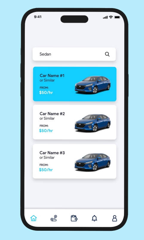
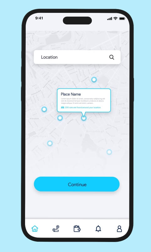
We were first asked to redesign the current application with a focus on the chat & discussion thread – the app was congested with little to no white spaces. The client wanted to declutter & give a facelift to the app.
/ 02 OUR ROLE
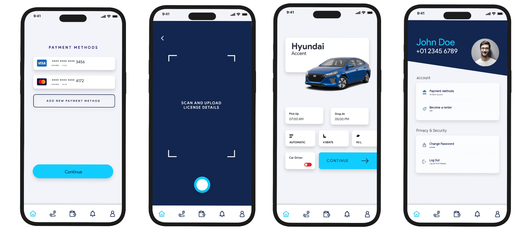
VOLAR MOBILE APP REDESIGN
We were first asked to redesign the current application with a focus on the chat & discussion thread – the app was congested with little to no white spaces. The client wanted to declutter & give a facelift to the app.
We were first asked to redesign the current application with a focus on the chat & discussion thread – the app was congested with little to no white spaces. The client wanted to declutter & give a facelift to the app.
/02
SITEMAP & USER RESEARCH
WHAT WE FOUND
We were first asked to redesign the current application with a focus on the chat & discussion thread – the app was congested with little to no white spaces. The client wanted to declutter & give a facelift to the app.
WHAT WE FOUND
We were first asked to redesign the current application with a focus on the chat & discussion thread – the app was congested with little to no white spaces. The client wanted to declutter & give a facelift to the app.
/03
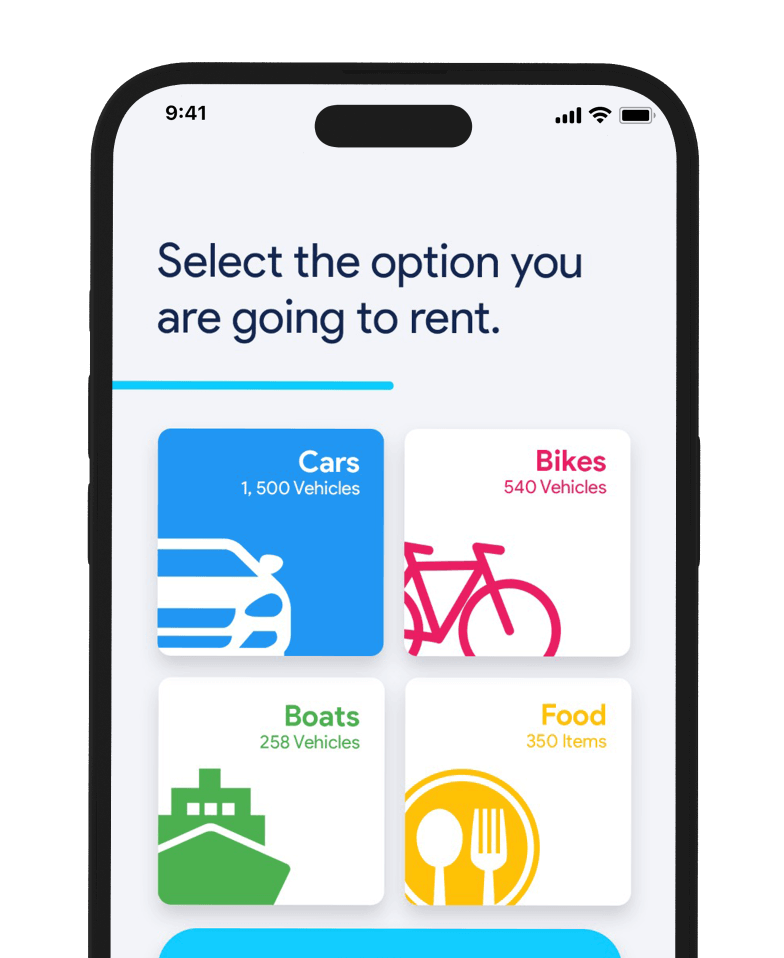
USERFLOW
WHAT WE FOUND
We were first asked to redesign the current application with a focus on the chat & discussion thread – the app was congested with little to no white spaces. The client wanted to declutter & give a facelift to the app.
WHAT WE FOUND
We were first asked to redesign the current application with a focus on the chat & discussion thread – the app was congested with little to no white spaces. The client wanted to declutter & give a facelift to the app.