Designing with the user in mind has been shown to deliver substantial financial rewards, such as boosting brand perception, increasing customer loyalty, and securing a larger share of the market.
SUMMARY
Designing with the user in mind has been shown to deliver substantial financial rewards, such as boosting brand perception, increasing customer loyalty, and securing a larger share of the market.
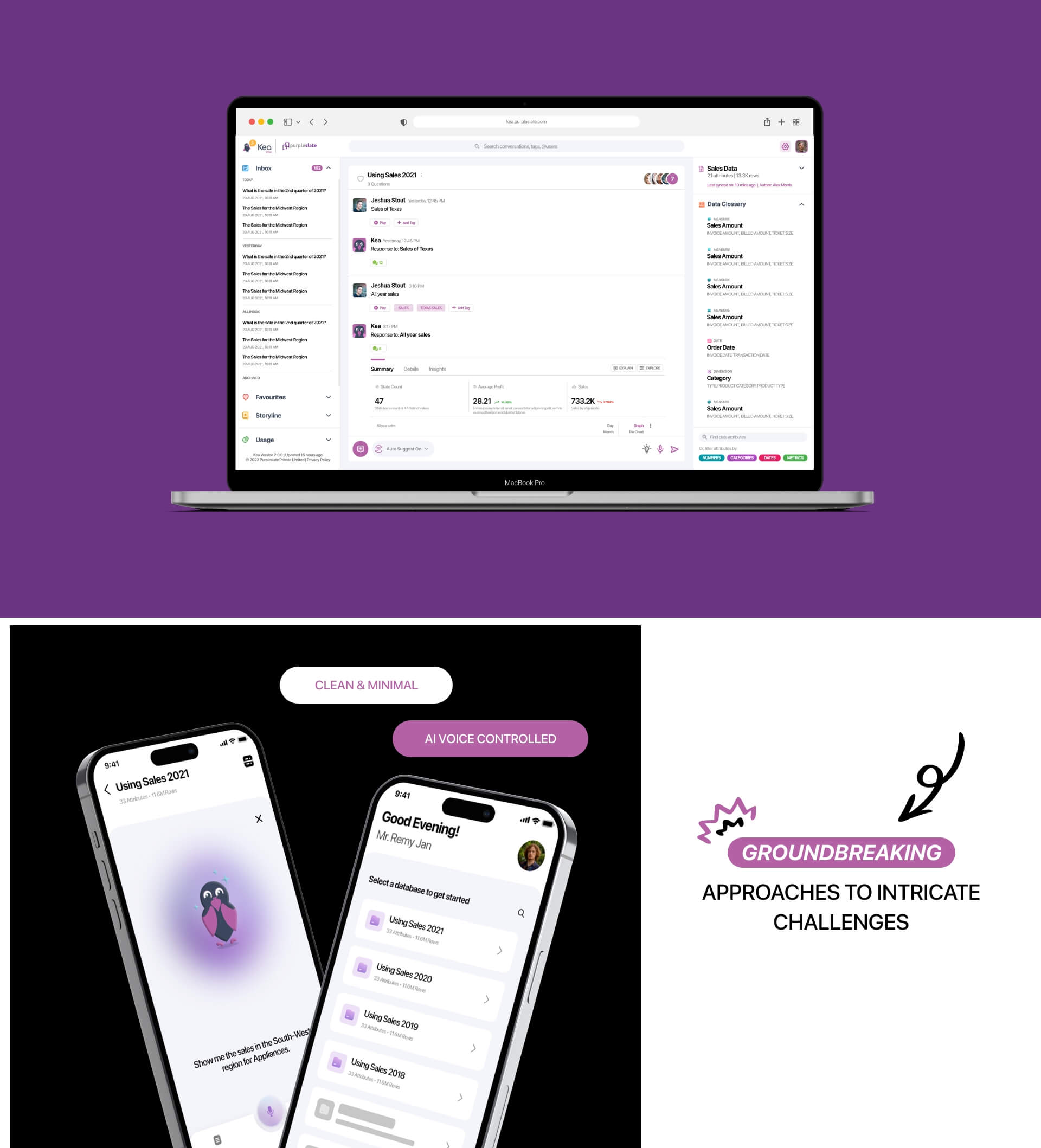
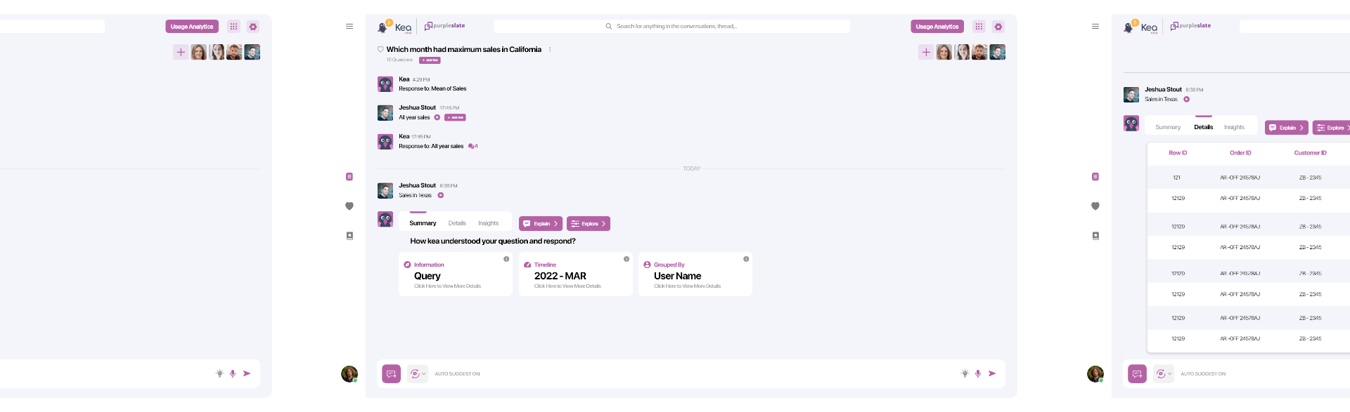
We were first asked to redesign the current application with a focus on the chat & discussion thread – the app was congested with little to no white spaces. The client wanted to declutter & give a facelift to the app.
/02
OUR ROLE
Our aim was to educate new users on the product, assist returning users in locating necessary information, and support companies in finding the solutions they seek. The facelift to the app should not hinder the existing users to feel alienated while using it, the app should give a sense of familiarity while at the same time being fresh.
PROBLEM
SOLUTION
PROBLEM
SOLUTION
Problem
1.
We were first asked to redesign the current application with a focus on the chat & discussion thread – the app was congested with little to no white spaces. The client wanted to declutter & give a facelift to the app.
2.
We were first asked to redesign the current application with a focus on the chat & discussion thread – the app was congested with little to no white spaces. The client wanted to declutter & give a facelift to the app.
3.
We were first asked to redesign the current application with a focus on the chat & discussion thread – the app was congested with little to no white spaces. The client wanted to declutter & give a facelift to the app.
Solution
1.
We were first asked to redesign the current application with a focus on the chat & discussion thread – the app was congested with little to no white spaces. The client wanted to declutter & give a facelift to the app.
2.
We were first asked to redesign the current application with a focus on the chat & discussion thread – the app was congested with little to no white spaces. The client wanted to declutter & give a facelift to the app.
3.
We were first asked to redesign the current application with a focus on the chat & discussion thread – the app was congested with little to no white spaces. The client wanted to declutter & give a facelift to the app.
RESEARCH PROCESS
UX (user experience) research is the careful study of your target users and their user interactions to guide the functionality and design of your app or website. UX research is systematic and entails driving all UX/UI decisions through robust data about your user personas.
STAGES
1. UX Audit
2. SITEMAP
3. USER FLOW
1. UX Audit
2. SITEMAP
3. USER FLOW
/01
UX AUDIT
WHAT WE FOUND
We were first asked to redesign the current application with a focus on the chat & discussion thread – the app was congested with little to no white spaces. The client wanted to declutter & give a facelift to the app.
WHAT WE FOUND
We were first asked to redesign the current application with a focus on the chat & discussion thread – the app was congested with little to no white spaces. The client wanted to declutter & give a facelift to the app.
/02
SITEMAP & USER RESEARCH
WHAT WE FOUND
We were first asked to redesign the current application with a focus on the chat & discussion thread – the app was congested with little to no white spaces. The client wanted to declutter & give a facelift to the app.
WHAT WE FOUND
We were first asked to redesign the current application with a focus on the chat & discussion thread – the app was congested with little to no white spaces. The client wanted to declutter & give a facelift to the app.
/03
USERFLOW
WHAT WE FOUND
We were first asked to redesign the current application with a focus on the chat & discussion thread – the app was congested with little to no white spaces. The client wanted to declutter & give a facelift to the app.
WHAT WE FOUND
We were first asked to redesign the current application with a focus on the chat & discussion thread – the app was congested with little to no white spaces. The client wanted to declutter & give a facelift to the app.
OLD VERSION
/01
UX AUDIT
WHAT WE FOUND
We were first asked to redesign the current application with a focus on the chat & discussion thread – the app was congested with little to no white spaces. The client wanted to declutter & give a facelift to the app.
WHAT WE FOUND
We were first asked to redesign the current application with a focus on the chat & discussion thread – the app was congested with little to no white spaces. The client wanted to declutter & give a facelift to the app.
NEW VERSION
/01
UX AUDIT
WHAT WE FOUND
We were first asked to redesign the current application with a focus on the chat & discussion thread – the app was congested with little to no white spaces. The client wanted to declutter & give a facelift to the app.
WHAT WE FOUND
We were first asked to redesign the current application with a focus on the chat & discussion thread – the app was congested with little to no white spaces. The client wanted to declutter & give a facelift to the app.
/01
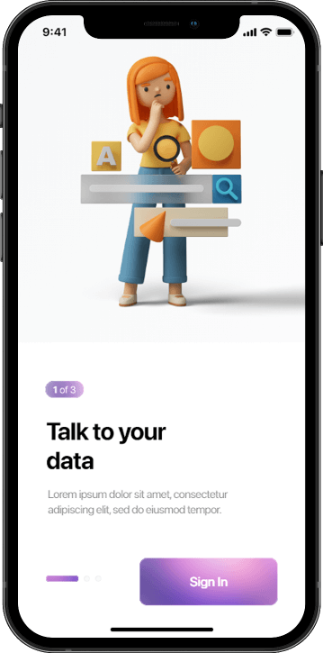
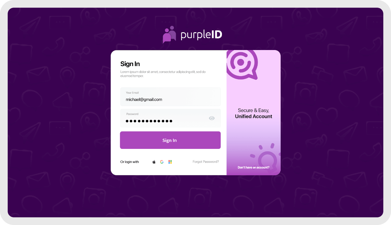
LOGIN SCREEN
We were first asked to redesign the current application with a focus on the chat & discussion thread – the app was congested with little to no white spaces. The client wanted to declutter & give a facelift to the app.
/02
UNIFIED SIGN IN
FEATURE
We were first asked to redesign the current application with a focus on the chat & discussion thread – the app was congested with little to no white spaces. The client wanted to declutter & give a facelift to the app.
/03
INITAL SCREEN
We were first asked to redesign the current application with a focus on the chat & discussion thread – the app was congested with little to no white spaces. The client wanted to declutter & give a facelift to the app.
/04
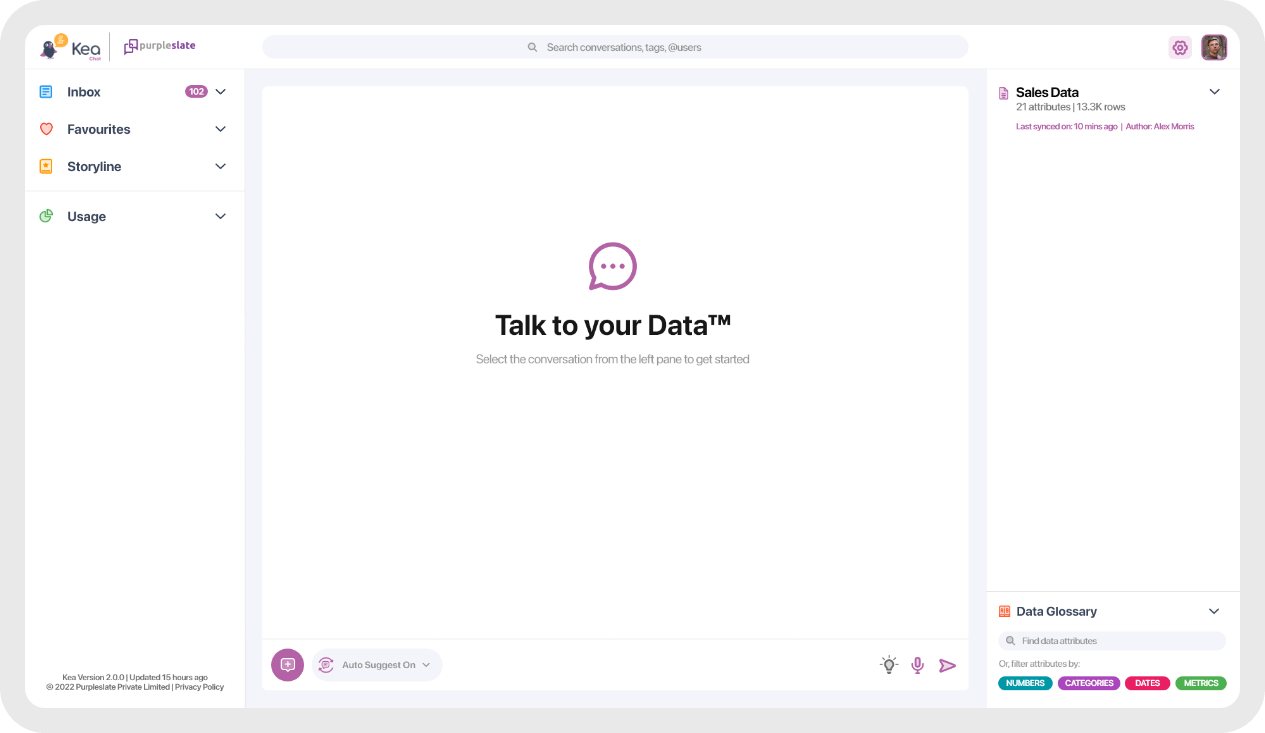
HOME
SCREEN
We were first asked to redesign the current application with a focus on the chat & discussion thread – the app was congested with little to no white spaces. The client wanted to declutter & give a facelift to the app.
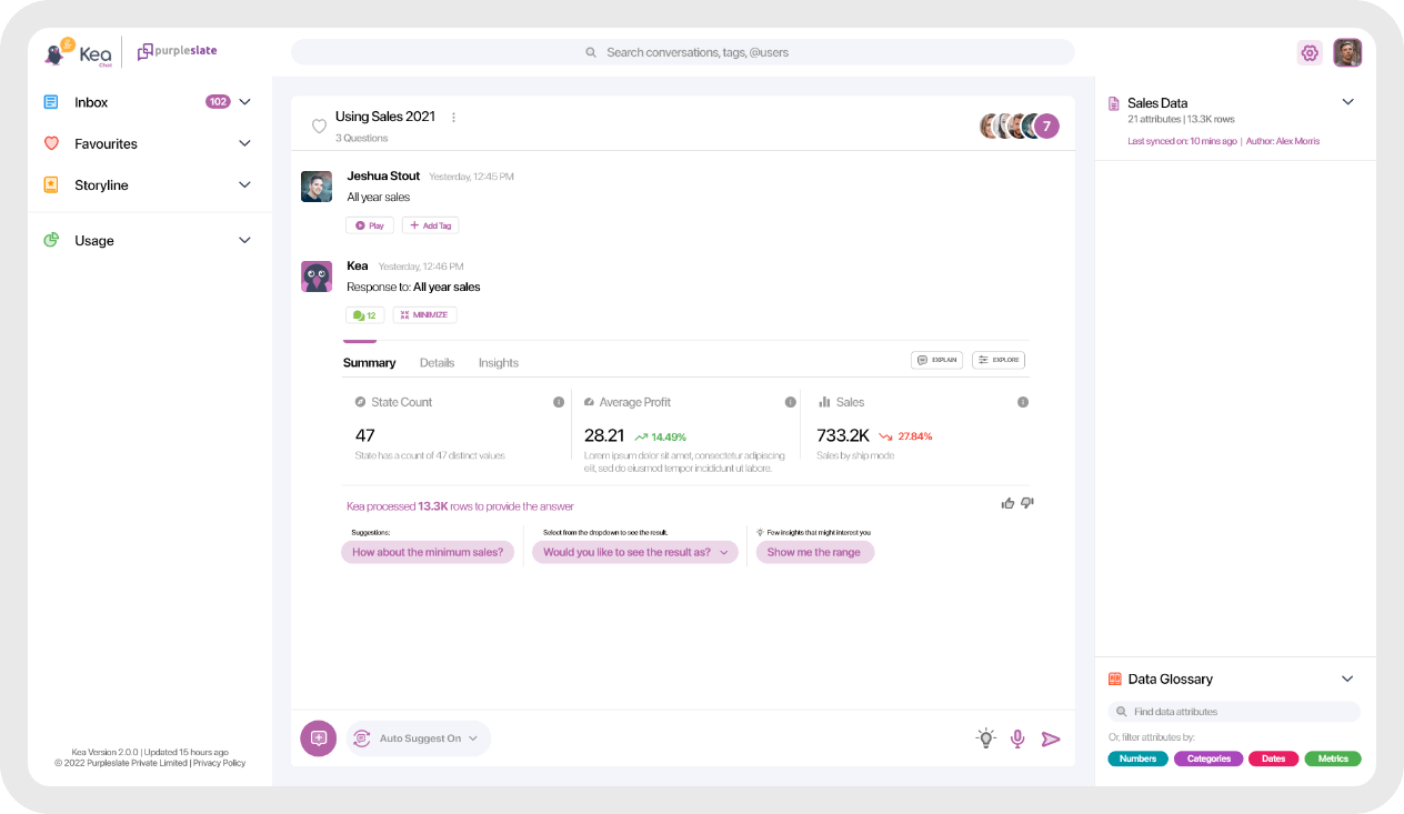
/05
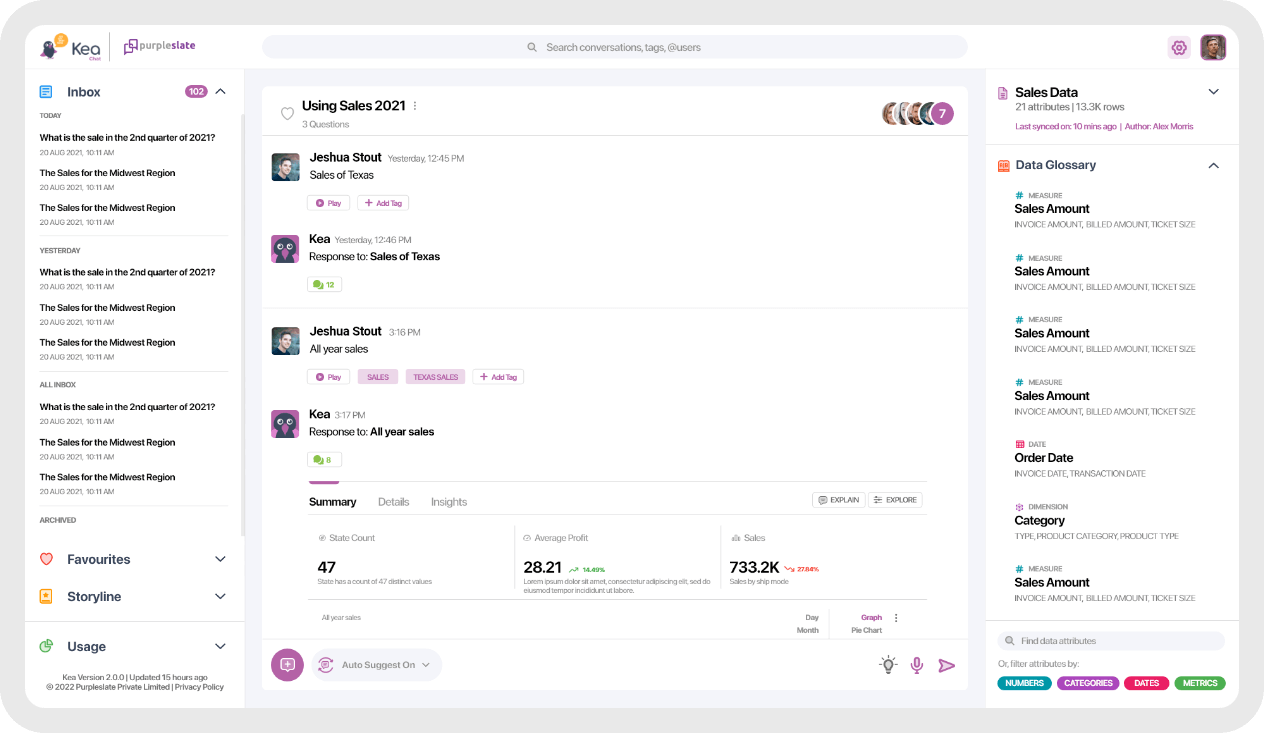
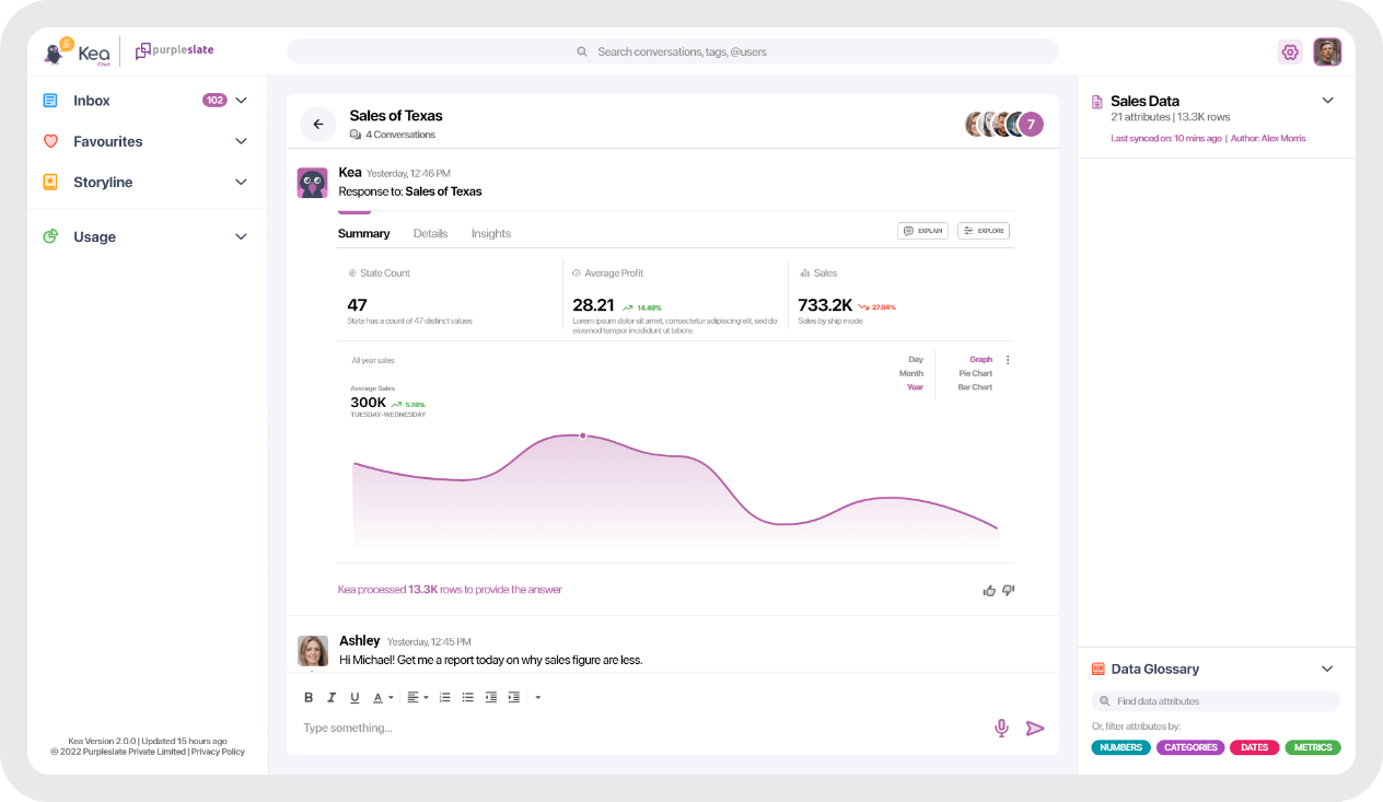
DISCUSSION THREAD
We were first asked to redesign the current application with a focus on the chat & discussion thread – the app was congested with little to no white spaces. The client wanted to declutter & give a facelift to the app.
/06
INTEGRATIONS
We were first asked to redesign the current application with a focus on the chat & discussion thread – the app was congested with little to no white spaces. The client wanted to declutter & give a facelift to the app.
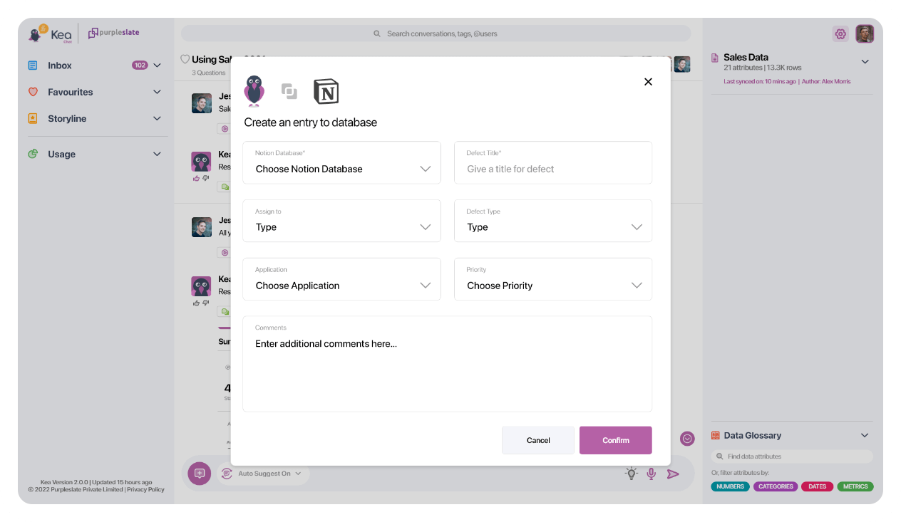
/07
ADD PEOPLE
We were first asked to redesign the current application with a focus on the chat & discussion thread – the app was congested with little to no white spaces. The client wanted to declutter & give a facelift to the app.
/08
PROMPTS
We were first asked to redesign the current application with a focus on the chat & discussion thread – the app was congested with little to no white spaces. The client wanted to declutter & give a facelift to the app.
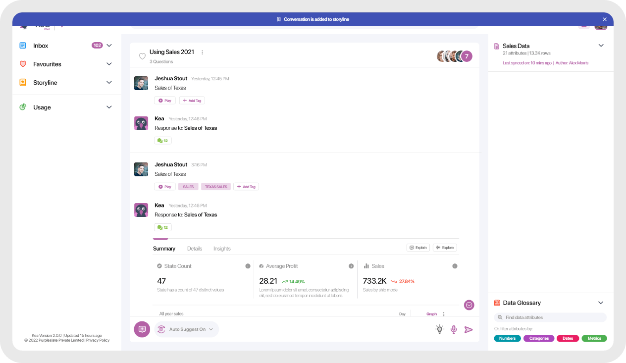
/09
TOAST NOTIFICATION
We were first asked to redesign the current application with a focus on the chat & discussion thread – the app was congested with little to no white spaces. The client wanted to declutter & give a facelift to the app.
CUSTOM ICONS
/01
DUOTONE ICONS
We were first asked to redesign the current application with a focus on the chat & discussion thread – the app was congested with little to no white spaces. The client wanted to declutter & give a facelift to the app.
BRANDING & SPECIAL APP ICONS
/01
SPECIFIC MADE APP ICON
A chat icon is a graphical representation used to indicate the availability of chat or messaging functionality within an application or website. It typically resembles a speech bubble or a text message symbol and is used to provide users with an easy-to-understand indication that they can communicate with others in real-time.
The purpose of these icons is to help recognize and celebrate the occasion and to bring a festive or celebratory feel to a project. They can also serve as visual cues for users, helping to communicate important dates and events.