UI/UX DESIGN
Declutter the app to better fit the users
CLIENT: NUTCRACKER
UI/UX DESIGN
Declutter the app to better fit the users
CLIENT: PARROT
SUMMARY
Designing with the user in mind has been shown to deliver substantial financial rewards, such as boosting brand perception, increasing customer loyalty, and securing a larger share of the market.
SUMMARY
Designing with the user in mind has been shown to deliver substantial financial rewards, such as boosting brand perception, increasing customer loyalty, and securing a larger share of the market.
/01
CLIENT REQUEST
We were first asked to redesign the current application with a focus on the chat & discussion thread – the app was congested with little to no white spaces. The client wanted to declutter & give a facelift to the app.
OUR ROLE
Our aim was to educate new users on the product, assist returning users in locating necessary information, and support companies in finding the solutions they seek. The facelift to the app should not hinder the existing users to feel alienated while using it, the app should give a sense of familiarity while at the same time being fresh.
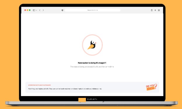
We were first asked to redesign the current application with a focus on the chat & discussion thread – the app was congested with little to no white spaces. The client wanted to declutter & give a facelift to the app.
We were first asked to redesign the current application with a focus on the chat & discussion thread – the app was congested with little to no white spaces. The client wanted to declutter & give a facelift to the app.
We were first asked to redesign the current application with a focus on the chat & discussion thread – the app was congested with little to no white spaces. The client wanted to declutter & give a facelift to the app.
We were first asked to redesign the current application with a focus on the chat & discussion thread – the app was congested with little to no white spaces. The client wanted to declutter & give a facelift to the app.
We were first asked to redesign the current application with a focus on the chat & discussion thread – the app was congested with little to no white spaces. The client wanted to declutter & give a facelift to the app.
We were first asked to redesign the current application with a focus on the chat & discussion thread – the app was congested with little to no white spaces. The client wanted to declutter & give a facelift to the app.
UX (user experience) research is the careful study of your target users and their user interactions to guide the functionality and design of your app or website. UX research is systematic and entails driving all UX/UI decisions through robust data about your user personas.
STAGES
WHAT WE FOUND
We were first asked to redesign the current application with a focus on the chat & discussion thread – the app was congested with little to no white spaces. The client wanted to declutter & give a facelift to the app.
WHAT WE FOUND
We were first asked to redesign the current application with a focus on the chat & discussion thread – the app was congested with little to no white spaces. The client wanted to declutter & give a facelift to the app.
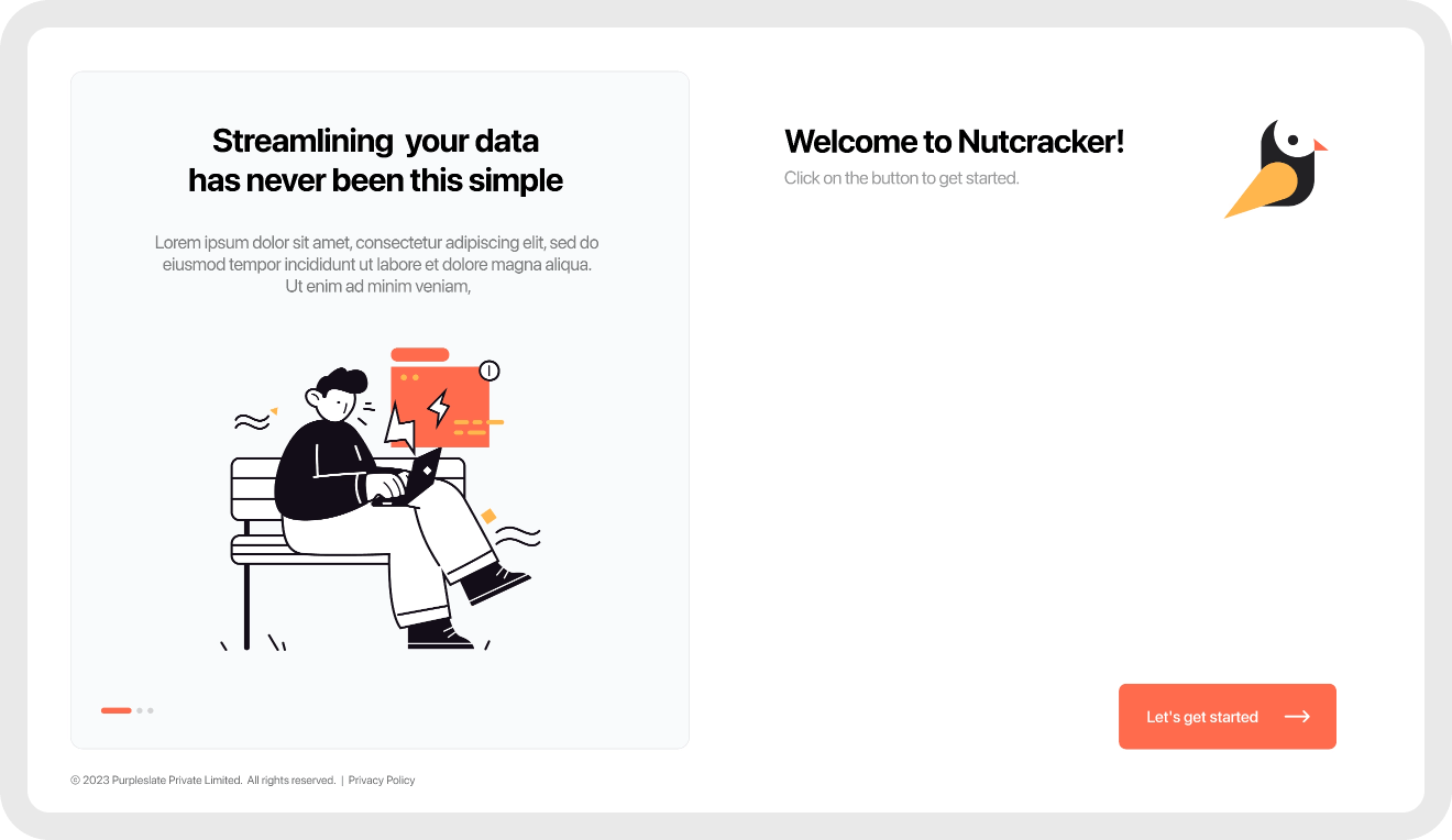
WHAT WE FOUND
We were first asked to redesign the current application with a focus on the chat & discussion thread – the app was congested with little to no white spaces. The client wanted to declutter & give a facelift to the app.
WHAT WE FOUND
We were first asked to redesign the current application with a focus on the chat & discussion thread – the app was congested with little to no white spaces. The client wanted to declutter & give a facelift to the app.
WHAT WE FOUND
We were first asked to redesign the current application with a focus on the chat & discussion thread – the app was congested with little to no white spaces. The client wanted to declutter & give a facelift to the app.
WHAT WE FOUND
We were first asked to redesign the current application with a focus on the chat & discussion thread – the app was congested with little to no white spaces. The client wanted to declutter & give a facelift to the app.
We were first asked to redesign the current application with a focus on the chat & discussion thread – the app was congested with little to no white spaces. The client wanted to declutter & give a facelift to the app.
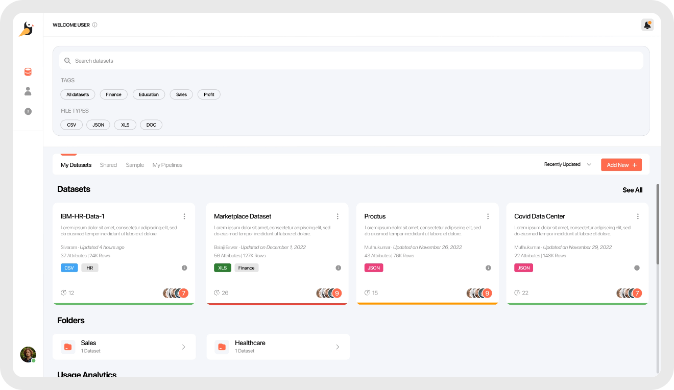
We were first asked to redesign the current application with a focus on the chat & discussion thread – the app was congested with little to no white spaces. The client wanted to declutter & give a facelift to the app.
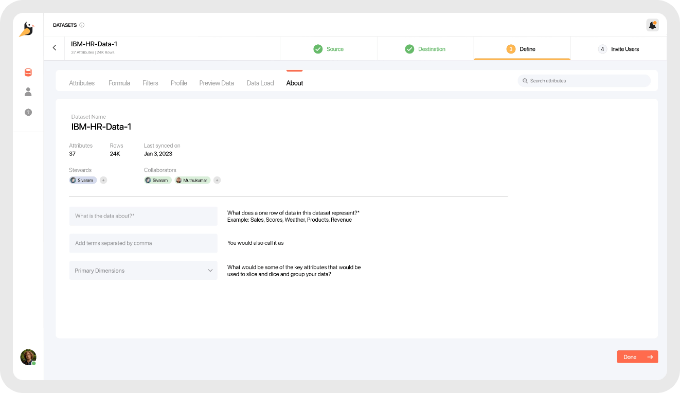
We were first asked to redesign the current application with a focus on the chat & discussion thread – the app was congested with little to no white spaces. The client wanted to declutter & give a facelift to the app.
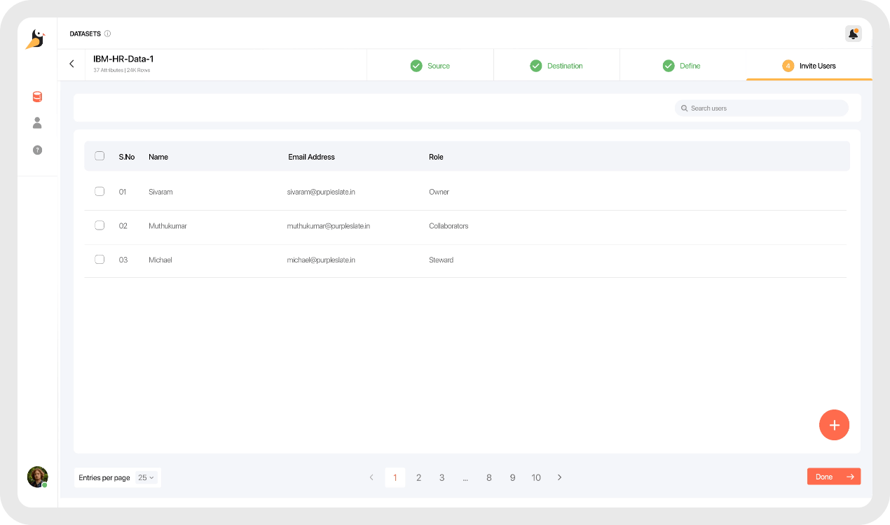
We were first asked to redesign the current application with a focus on the chat & discussion thread – the app was congested with little to no white spaces. The client wanted to declutter & give a facelift to the app.
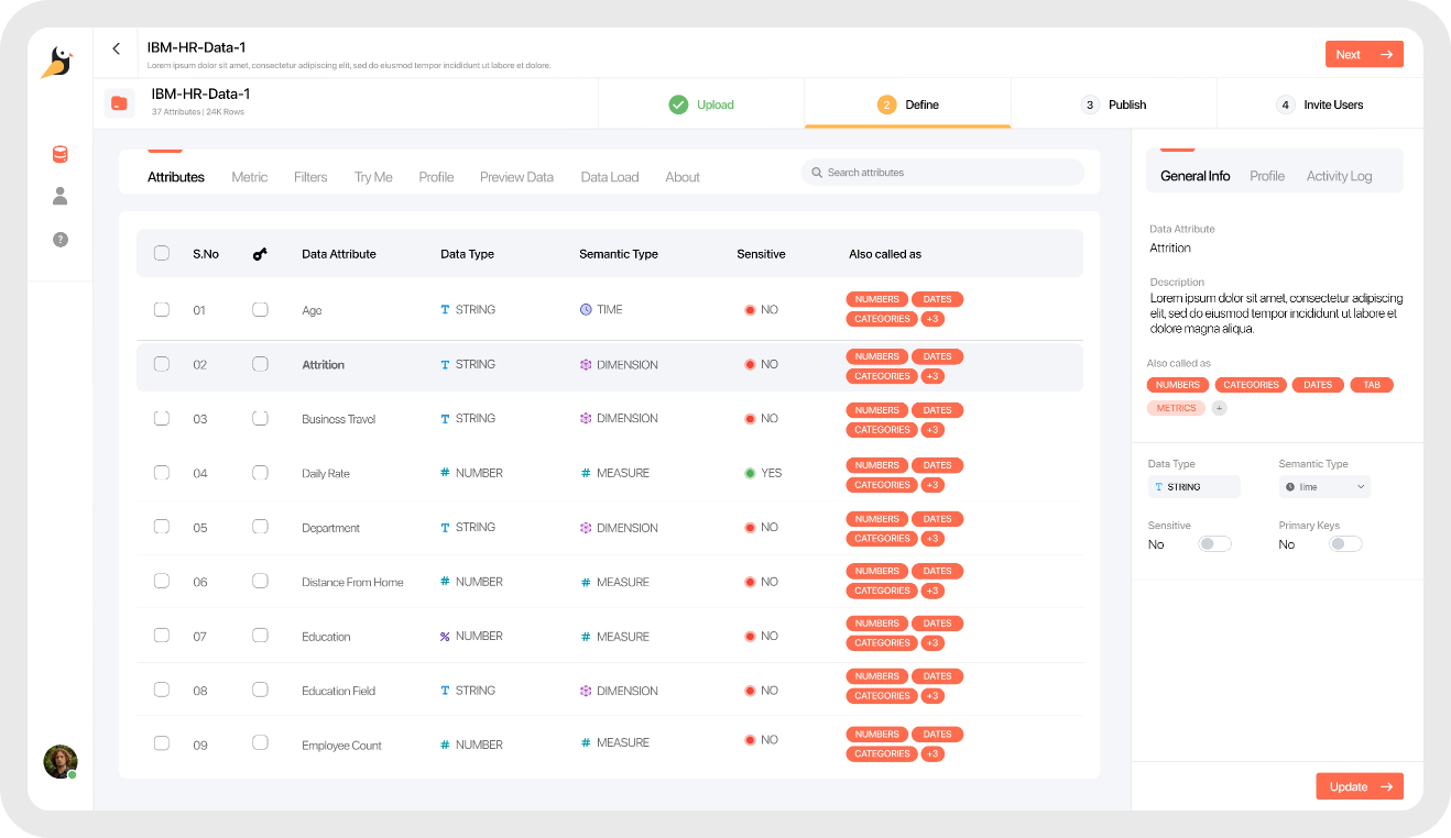
We were first asked to redesign the current application with a focus on the chat & discussion thread – the app was congested with little to no white spaces. The client wanted to declutter & give a facelift to the app.
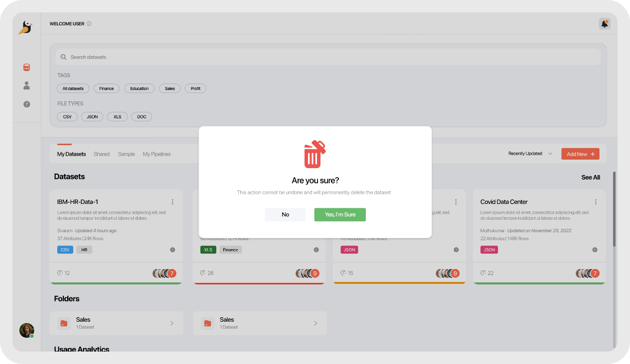
We were first asked to redesign the current application with a focus on the chat & discussion thread – the app was congested with little to no white spaces. The client wanted to declutter & give a facelift to the app.
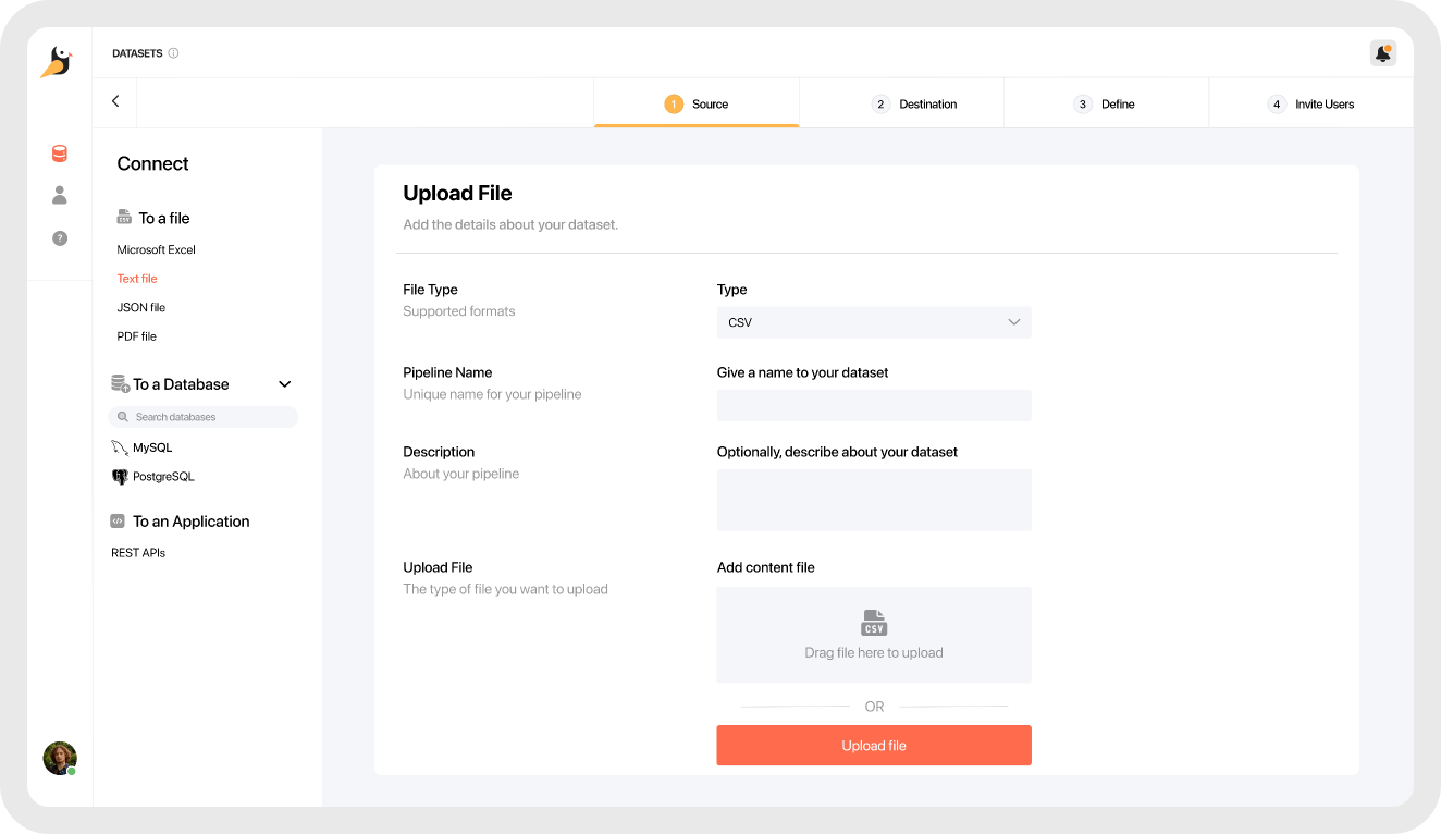
We were first asked to redesign the current application with a focus on the chat & discussion thread – the app was congested with little to no white spaces. The client wanted to declutter & give a facelift to the app.
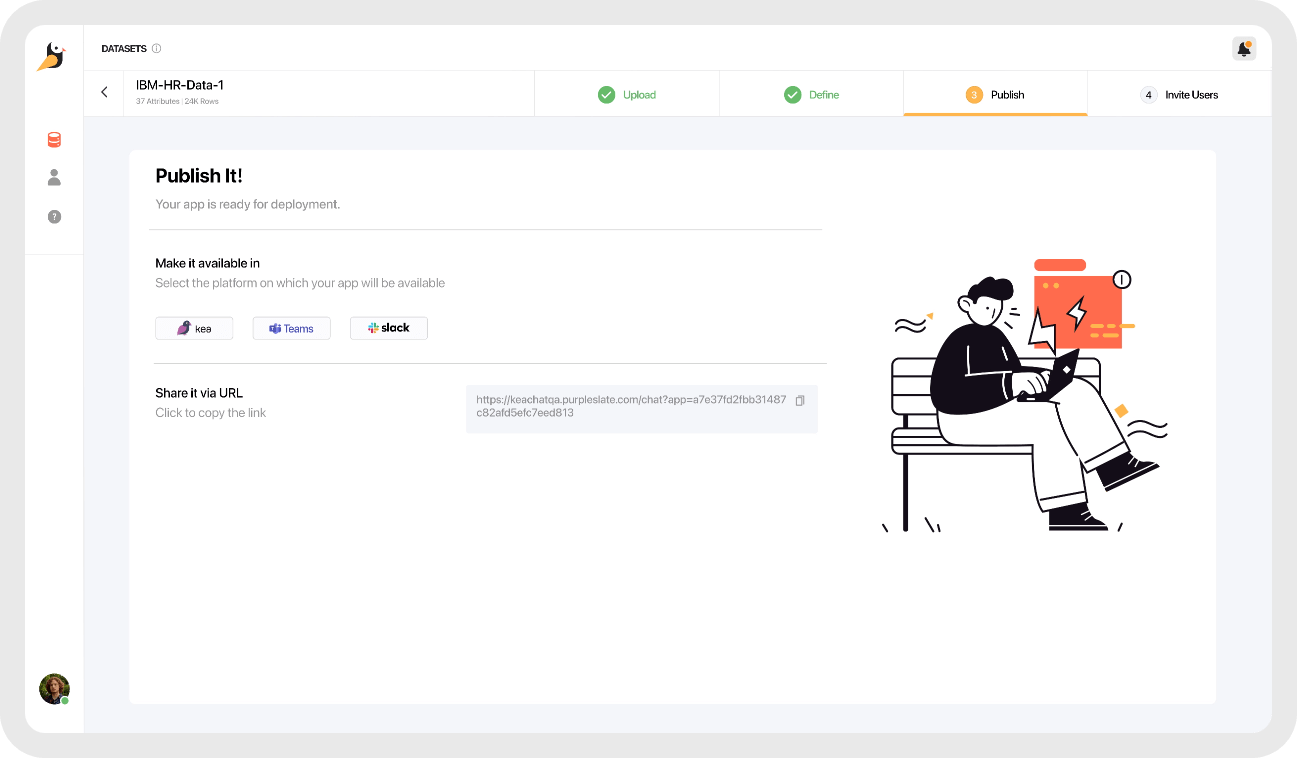
We were first asked to redesign the current application with a focus on the chat & discussion thread – the app was congested with little to no white spaces. The client wanted to declutter & give a facelift to the app.